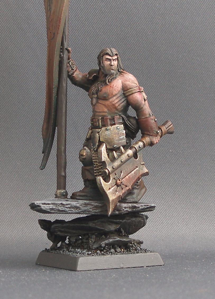
Ok,so today is competition day...and he's done! WELL...I say that...im not happy with his banner,i tried at a simple design,and it just looks...wrong... So,I'm going to enter him as he is anyway,and whatever the result,I'm gonna repaint the banner...then you boys and gals can see him properly. For now,you get this view...I tried a more 'ainty' approach to him,like a portrait artist was viewing the Marauder straight after a battle or something...i thought the dirty approach would suit this sort of chap well! I tried getting a bit of expression into the face,as it turned out to be a horrible one to paint as it was...whilst the Perry twins are great sculptors,I do feel sometimes that the faces they sculpt lack a little definition..still,on the other hand,it gave me a good reason to try something a little more advanced...see what you think! I'll get the banner re-painted...then you can see the rest Comments and critiques welcomed as ever. Ben x
Looks good. Great paint job (and the model as a whole). Much better than anything I could ever do.
As for constructive criticism, I think the head is a bit out of proportion to the rest of the body (particularily the arms and chest area). It seems that attention to detail has been lavished on the face, but is lacking (be it painting or modeling) on the chest making the head look a little out of place and the chest a little "GI Joe".
It could be because the head is refined and detailed, but the body is "I can rip your throat out with my pinkie".
Regardless, the model as a whole is excellent. Maybe a little bit of dead grass (the tan/brown stuff that GW doesn't sell) on the base and it's fantastic ^_^
Class paint job as always. As for criticism, I think a brighter banner would set some contrast up, I think the way he is now when he hits the battlefield he's blend in a bit too much with the scenery, and I don't think he's the type for not standing out! Of coarse he's more realistic as he is now, but when was realism fun in Warhammer Call me crazy but when I saw him the first thing I thought was "This guy needs some woad, the blue warpaint (or maybe died blood, him being chaos). Maybe a line going down the side of his face and torso? Keep up the good work Ben!
--
If you can read this congratulations. Only 2% of Web users can read cleartype2 fonts. If you are one of those copy and post this to your sig!
I must admit though, he doesn't look all to 'chaosy'.. had it not been for the title and the insignia on his blade, he could have been a regular man, if not a strapping one
--
Do not let your left hand know what your right hand is doing
New deals posted everyday, starting Black Friday and running through the holiday season! No hassles, no lines - just awesome savings on art, deviantWEAR, Premium Memberships and more!
Discussing page views, activity and popularity, ~ChaoticSkye explores the inner workings of the community on deviantART from her point of view.
Although this does not apply to everyone, we hope the article is a worthwhile read and that the majority perceive things from a different point of view from reading this.
Daily Literature Deviations is a group that is dedicated to bringing literature to the forefront of the deviantArt community. We attempt to accomplish this by daily featuring Literature artists from around the community that deserve the recognition, but are not getting it.
Each day we will feature 5 deviations from the Literature categories in a News Article. In order to support the artists that we feature, we ask that you the news article as well as check out the individual pieces. We understand that each day you may not be able to check out each and every one of the pieces, everyone has their own things going on. We just ask that you make an attempt to help support the growing Literature community.
'What Does Christmas Mean To You?' is our theme for this contest! It's pretty simple to enter, open to all mediums, and a 3 Month Subscription is amongst the prizes offered, so what are you waiting for?
The Deviousness Award is an accolade which is traditionally handed out on the 1st of every month to one trully outstanding deviant. `Cyantre is one of the most helpful deviants within our community. With a positive attitude and a resourceful mind, you can always find him providing support and encouragement to those in need. Always looking for ways in which he can get more involved in our community, John's positive presence is to be aspired to. A well respected poet, John is a must-have on your deviantWATCH to make sure that you don't miss out on your dose of community inspiration. It's with great pleasure that the Deviousness Award for November 2009 goes to... Read More
Comments
--
Hiking Metal Punks Forever!
The extra work on his face was worth it then...
Ben
--
All the artistic talent of a cluster of colourblind hedgehogs...In a bag.
--
Hiking Metal Punks Forever!
As for constructive criticism, I think the head is a bit out of proportion to the rest of the body (particularily the arms and chest area). It seems that attention to detail has been lavished on the face, but is lacking (be it painting or modeling) on the chest making the head look a little out of place and the chest a little "GI Joe".
It could be because the head is refined and detailed, but the body is "I can rip your throat out with my pinkie".
Regardless, the model as a whole is excellent. Maybe a little bit of dead grass (the tan/brown stuff that GW doesn't sell) on the base and it's fantastic ^_^
--
Visit Forge Valley Today!
Population: [link]
Industry: [link]
Transport: [link]
Security: [link]
--
Please visit my other galleries:
Sheezyart's gallery [link]
Furaffinity [link]
Consumo dunque sono.
Call me crazy but when I saw him the first thing I thought was "This guy needs some woad, the blue warpaint (or maybe died blood, him being chaos). Maybe a line going down the side of his face and torso? Keep up the good work Ben!
--
If you can read this congratulations. Only 2% of Web users can read cleartype2 fonts. If you are one of those copy and post this to your sig!
--
Do not let your left hand know what your right hand is doing
--
Do not let your left hand know what your right hand is doing
Aside from the banner looking a bit chunky, I can't find fault w/ any of it
--
"Broken is he, who cannot stand against the darkness"
- Longscope
Previous Page12345...Next Page